Cafe Mornings
2025
Website Redesign, UX/UI Strategy
About
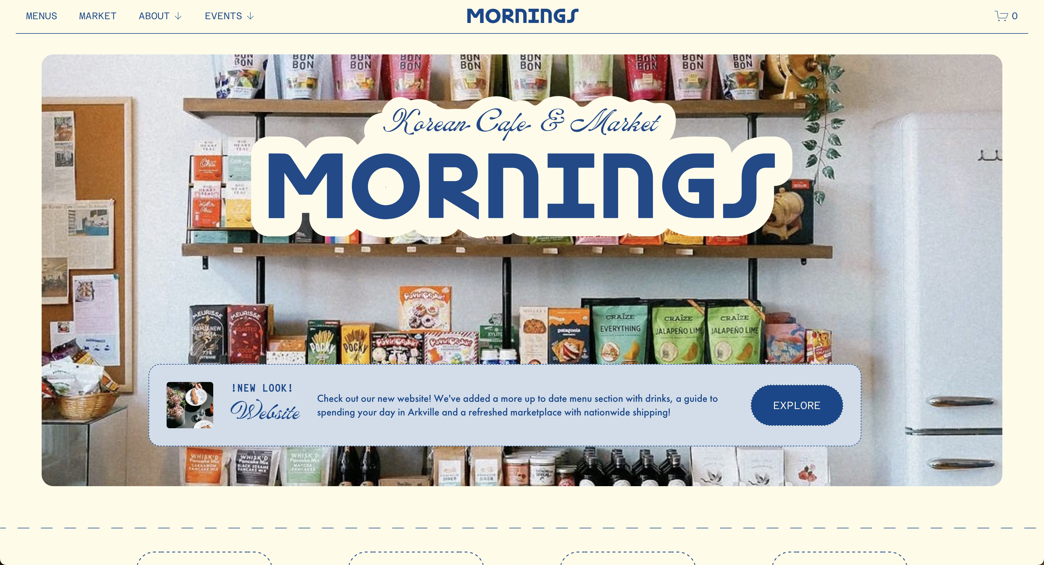
Cafe Mornings is a family-run Korean cafe and market in the Catskills, serving breakfast and lunch alongside curated pantry items and gifts, drawing locals, families, and travelers passing through Route 28.
Existing Site Audit
I evaluated the existing site through heuristic analysis and scenario-based review, focused on how first-time visitors and returning users find key information and understand what the cafe offers. Issues I found:
- • Inconsistent typography, color, and button styles undercut brand credibility
- • No clear path for primary goals — travelers looking for menu/hours/location, locals browsing pantry items
- • Menu was hard to locate and not scannable
- • No clear distinction between cafe, market, and event offerings
- • Homepage didn't communicate what made the business distinct
Project Goals
- • Clarify site structure around primary user goals: view menu, plan a visit, browse market items
- • Improve navigation and content hierarchy
- • Distinguish cafe and market offerings clearly
- • Create a strong first impression for new visitors
- • Build a flexible system the client could update independently
My Role
- • Contributed to UX/UI strategy through wireframes and iterative design
- • Designed and built site pages in Squarespace, using custom code to extend layout and interaction beyond template defaults
- • Translated visual assets into a modular UI system aligned with content structure
- • Designed interaction patterns (buttons, hover states, loading) for usability and feedback
- • Delivered documentation for client handoff and ongoing updates
Constraints
- • No existing content hierarchy to build from
- • Platform limits required scalable, low-maintenance layout choices
- • Limited budget and development scope
- • Needed one unified system to support cafe, market, and events
Key Design Decisions
- Homepage prioritizes orientation before action
- Many visitors arrive from search or maps with little context, so I structured the homepage to first communicate the cafe's hybrid identity — dining, retail, event space — before pushing specific actions. To avoid slowing down visitors who already know what they want, I kept menu, hours, and location accessible through persistent navigation.
- Navigation built around user intent, not old structure
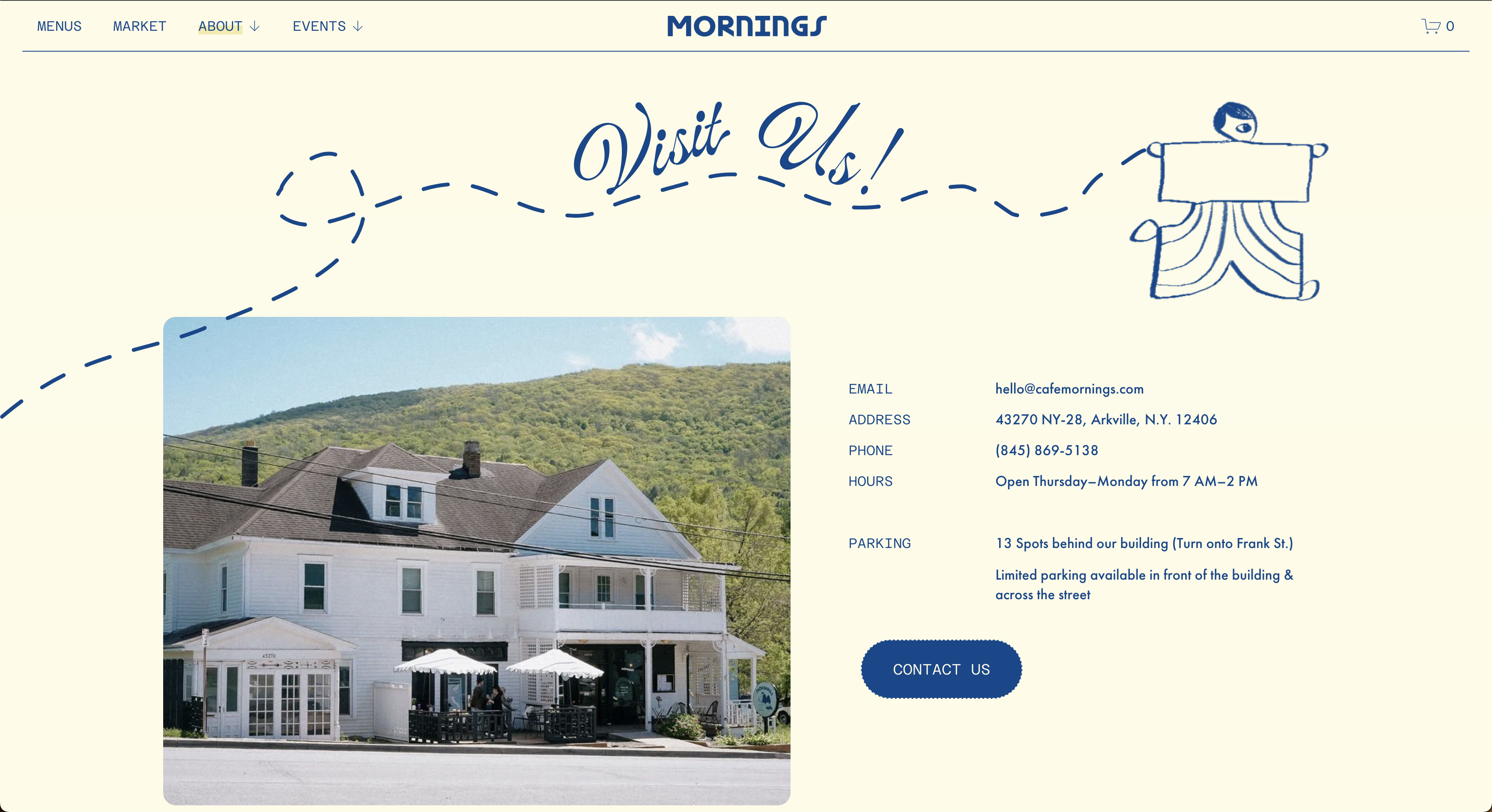
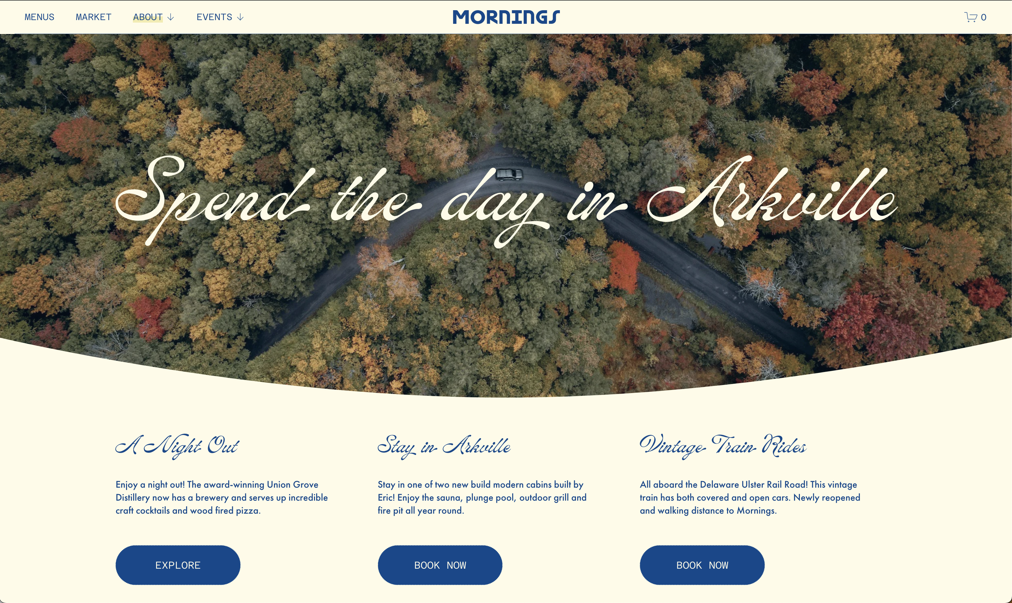
- I reorganized navigation around what users actually came to do — visit the cafe, browse the market, learn about the space — rather than the site's previous structure, which didn't map to real user goals. A more defined structure risked feeling less playful, so I kept the navigation predictable while giving visual design room to stay expressive.
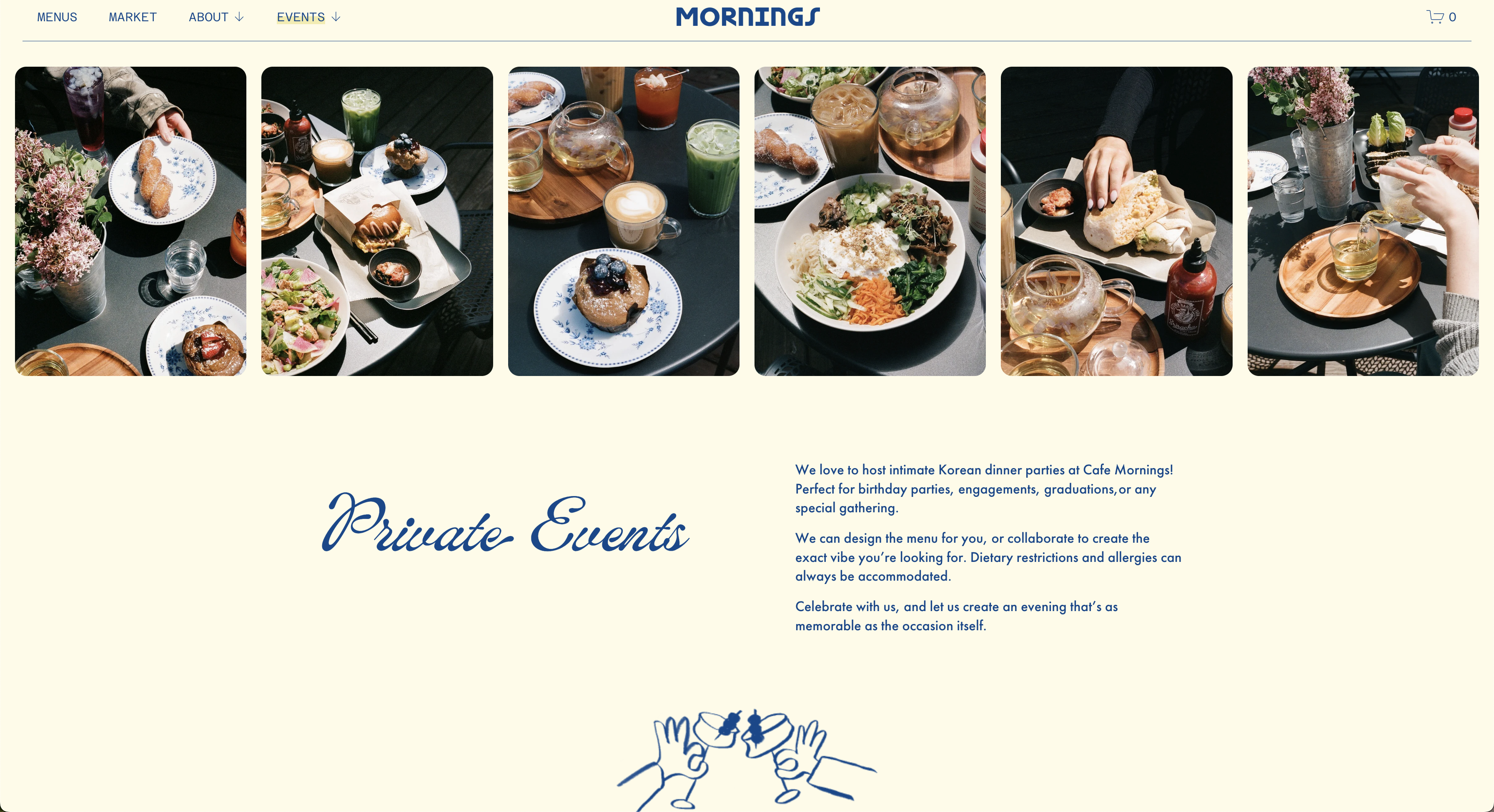
- Separate paths for cafe and market.
- Cafe visitors wanted quick, scannable information; market browsers wanted something more exploratory. I gave each its own page structure while keeping a shared visual language so the site didn't feel fragmented.
- Visual elements in service of hierarchy, not decoration.
- The existing illustrations were expressive but disconnected from the interface's structure. I used them selectively, at key moments, to reinforce hierarchy and readability rather than as pure decoration — trading some visual density for clarity without losing the brand's personality.
Results
- • Clear distinction between cafe and market offerings
- • Faster access to menu, location, and hours
- • Stronger first impression for new visitors
- • A flexible, modular structure the client can update independently
- • Informal usability checks showed users locating key information faster